2011 haiti_utk publication

One to Another

A Downloadable Publication from the 2011 Haiti UTK Studio


WBIR Report of the Haiti Studio

Introduction haiti_utk

Welcome to the Haiti UTK site! The work on these pages reflects student engagement in design for both a school and housing for the community of Fonds des Bloncs, Haiti in collaboration with the Haiti Christian Development Fund. The project was initiated in the early fall of 2010 and subsequently a class of 19 students, in the spring of 2011, was given the responsibility of deisgning a secondary school. The school is under constuction. A new group of students is now hard at work developing new housing in Fonds des Blancs. The work of these students can be seen in the pages of this blog. Students of the class will be traveling to Haiti Februay 2-6 to collect addiional data. It is anticipated that this second phase of the project will be completed in late April with construction starting summer 2012. The work of the students is being guided by three primary faculty, John McRae, David Matthews, and Chris King, a local practictioner. The students during their exploration will engage a wide range of issues including context, culture, resources, climate and other outside factors not common to their expereince. 

Students: Cassidy Barnett, Aaron Brown, Sarah Heimermann, Mitzi Coker, Emily Corgan, Ben Cross, Peter Duke, Emily Fike, Sam Funari, Lauren Heile, Kendra McHaney, Lauren Metts, Morgan Oiler, Bernice Paez, Forrest Reynolds, Emily Ryan, James Sawyer, Zachary Smith, Robert Thew, Cory Wikerson Faculty: John McRae, Chris King, David Matthews

search haiti_utk
Special Thanks!

The Haiti Studio for spring 2012 is being supported by HaitiServe foundation based in Knoxville Tennessee, that is focused on outreach and engagement in improving conditions in Haiti. 

haiti_utk public blog index

Entries in site (3)

Wednesday
Feb222012

Final Site Design Proposal

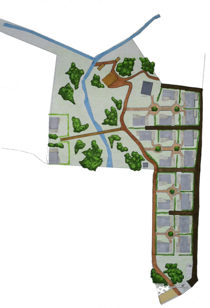
Final Site Plan

In designing a site proposal, our new team wanted to synthesize the strengths of our previous schemes. This amalgamation of concepts, drivers and priorities eventually yielded a site plan that would be practical, beautiful and functional. Above all, we wanted to design according to the human scale, ensuring a meaningful connection between the inhabitants of this development and the built environment. While many things drove our design, there were three concepts that impacted decisions more than others. First, to create a strong sense of community; second, to provide a sense of order that is easily understood and clearly recognizable; and third, to design universally, allowing all people to utilize every feature of the site.
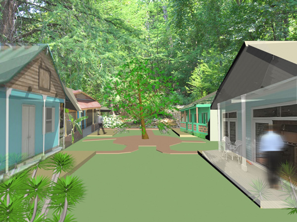
Courtyard PerspectiveThe shared courtyard was the primary avenue with which community was emphasized. We believe that every community needs a tool to enhance social interaction, and that this interaction is necessary and beneficial for every resident. An elongated courtyard ensures a relationship to the pedestrian path that winds through the site, thus connecting the residents to others that may not live within their cluster of homes. By placing the main entrance to the home on the inside of the courtyard, social interaction is optimized and community is created.
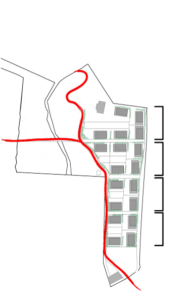
 Order vs Organic

We recognized that in a nation that has just experienced tragedy, creating a sense of order would be paramount. Often times, the perception of order is equated with security and safety, so we sought to develop a clearly organized, rigidly executed site plan with one moment of break from that system. The streets (vehicular circulation) were forced to snap to a grid that established the footprint of our blocks, while the pedestrian path to the west of the homes was allowed to break that geometry and follow the natural topography of the land. This breaking of the system allowed for ultimate convenience while one moves through the site. The organic pedestrian path was not a matter of preference, but one of convenience and livability. We sought to create a development that catered to the everyday lives and activities of its residents, rather than to the chance visit by a passerby.
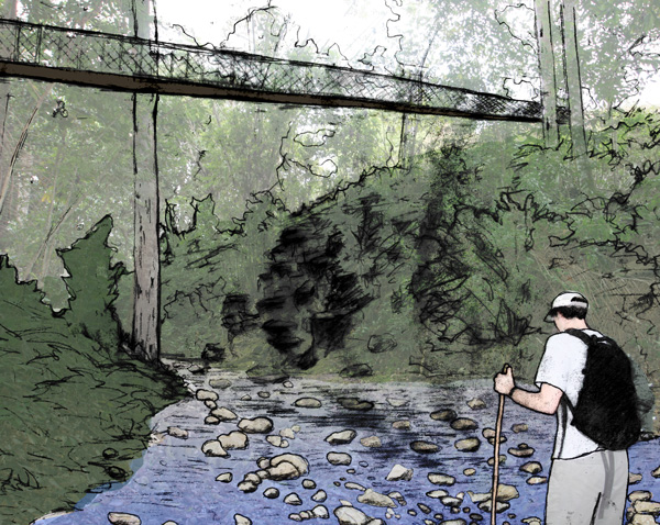
Pedestrian Bridge

In order to allow the development to be utilized by the maximum number of people, we decided that universal design would need to be decision driver. As mentioned earlier, the organic pedestrian pathway was a response to convenience and livability, because half of this development will be inhabited by Ex-patriots who are returning to Haiti to retire. This meant that minimal elevation change along walkways and paths was absolutely essential. The easiest and most inexpensive way to accomplish this was to allow the path to follow the natural topography of the land, creating the organic shape seen above. This ideology was even carried into the design of the footbridge that will span the stream that cuts the site in two. It connects the two points on site that have the least elevation change, allowing for ease of access and continual usage. In addition, the elevated bridge allows for phenomenal views and an unparalleled experience within the site.

These values are not only crucial to a successful masterplan of the site, but are also crucial to the design of the individual homes. Ultimately, our duty is to serve people as best we can. By recognizing exactly what people need and desire in a home, we are able to respond through design and create a space that will be livable, beautiful and enjoyable.

 

Gallery of Presentation Drawings and Key Images

Friday
Feb102012

Enveloped in a New Culture and Site

Culture


Visiting Fond-des-Blancs opened our eyes to what is truly important in Haitian design. Our first observation was that porches are a vital means to socialization in Haiti. The porch is said to be the main spot for socializing with friends and family and is often considered a room of its own. The ideal weather conditions make being outside much more comfortable than being indoors. Also, we were told that most Haitians leave the interior of their home as a space for only themselves. Much like we would invite guests into our living rooms, Haitians use their porches as their main living space.

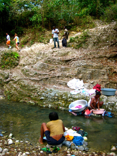
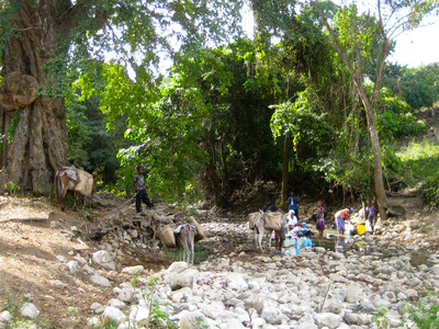
Another observation that was made is that Haitians rely heavily on local streams and rivers for bathing and washing their clothes.  Though this is part of their day-to-day life, we are hoping that adding a laundry service to the commercial/residential area would be appealing to many people. The laundry service would be located in one of the stores below the apartments and preferably run by a Haitian living in the community.

Cooking outdoors has consistently influenced our ideas for the housing design thus far. We have tried to incorporate not only cooking areas but also eating areas outdoors because we assumed that is what Haitians would enjoy. However, we came to find during our visit that, though they enjoy the outdoors, we should leave eating areas indoors and consider rainy days when designing the cooking areas. Charcoal grilling outside needs to be an option but cooking should be pushed indoors.


Site Overview

After blindly picturing the site for weeks, it was an eye opener to finally have the chance to explore the site. The studio as a whole had expected the topography of the site to be a struggle, but the extreme slopes of the site were a bit shocking to most.  There is far less semi-flat land to build on than we had expected. The slopes at times seemed to reach a 45 to 60 degree angle down to the river. We have thrown around the idea of putting housing on stilts and breaking the houses into zones that can be tiered along with the slope. After seeing the actual topography, we feel this is the correct path to take.

Our group has placed most of the housing development in a high-density vegetation area on the site. We see this both as an asset and possible problem. The vegetation can help shade the housing, but could also create problems when the lots are being laid out. We want to avoid cutting down trees or ruining the land so we would like to preserve as much vegetation as possible.

One of the most intriguing parts of the site to our group was the connection of the river and small stream. We believe it would be a great gathering spot and highlight of the site. Our group has pictured this connection point as a place for social gatherings and pavilions for the community. The streams/rivers seemed to be the main places we saw people outside of their homes in Haiti so we believe this connection is the ideal spot for a community space.

The size and feel of the initial long strip of land at the front of the site came as a pleasant site to our group. Our ideas of a combined commercial and residential area seem to be able to work well. The width of the strip of land and small amount of vegetation seem to be perfect for our proposed ideas.


Site Analysis - Low Vegetation

Similar types of low vegetation were observed towards the back of the site near the river. The initial strip of land at the front of the site seemed to house a few different types of vegetation compared to the rest of the site. The front of the site is significantly less dense with vegetation compared to the rest of the site, which could be the cause for this difference in vegetation. The specific types of vegetation have not yet been recorded because we are currently exploring the possibilities of what each might be.

Friday
Feb102012

Visit to Fond des Blancs


Culture:

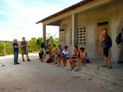
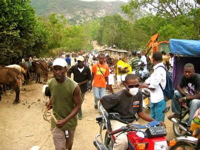
Our group’s cultural experience of Haiti was life changing. Coming from a country where everything is handed to you, then going to a country that doesn’t have much was a huge cultural shock. No running water to take showers daily, or even electricity to watch your favorite tv show, was a huge change. Time in Haiti was slow, where days in Haiti started and ended early, forcing you to manage your time wisely.  We ventured out every morning to walk and observe how the Haitians spent their days. The people of Haiti labor daily to collect water, tend livestock, and farm lands. We also took part in some of the Haitians daily rituals like bathing in the river, eating typical meals, and hiking the countryside. The aroma of Haiti was the smell of burnt charcoal. It filled the breezes on the mountaintop permeated the valleys. Haitians also take pride in the way they dress. Colorful ribbons and dresses, creased shirts and jeans, as well as name brand clothing. They carried themselves with self worth even though they had less than us.

Site Overview:

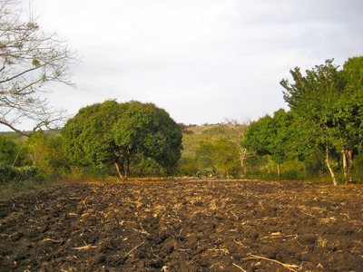
Observing our site in person was a necessity in order to fully understand the typography and scale. We were able to reconfirm that the front stretch of the site is ideal for commercial structures and multi-story dwellings. The land was already cleared for farming, which fits directly into our design proposal. We realized that the ridge had a much steeper slope than we had initially perceived and that some of our houses will need to be pulled back from the steep edge condition. The area that we proposed for the pavilion is already cleared out and is oriented perfectly for a communal space. We discussed the potential for developing split-level housing on the west portion of the site. This would allow for minimal terracing while taking advantage of the current views. This side will also be contingent on the ability to use part of phase two to allow for a road to access the site, providing a way for residents to bring their cars directly to their houses.

Site Analysis:

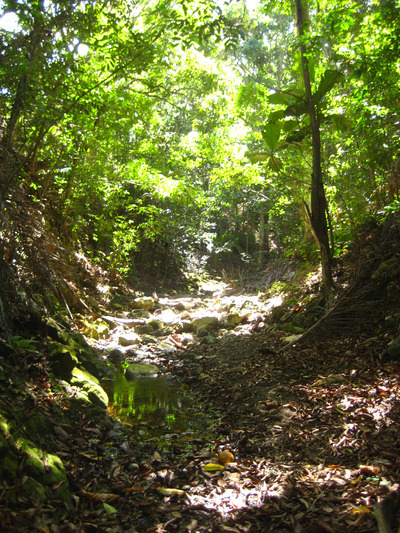
Our group was given the task of documenting the types of trees on the site. We noted the placement of significant trees that should be kept. Our main assignment was to take photographs of the leaves and bark of the trees that we did not know so that we can determine their species. The goal of this documentation of vegetation is to compile a palate of plants and trees that are native to the area that we can use for landscaping throughout our site. We were able to identify several palm trees, mango trees, and even an almond tree.